سیستم طراحی، از صفر در فلاتر
به این مقاله توی مدیوم برخورد کردم و دیدم چقدر مفید هست. برای همین تصمیم گرفتم که اینو ترجمه کنم.

طراحی سیستم از صفر در فلاتر
در ابتدا، راهحلهای متعددی برای ایجاد یک دیزاین سیستم برای اپلیکیشن شما در فلاتر وجود دارد. من میخواهم تجربهام را در مورد دیزاین سیستم، که قبلاً در پروژههایمان پیادهسازی کردهایم، به اشتراک بگذارم.
چرا به یک دیزاین سیستم نیاز داریم؟
دیزاین سیستم مجموعهای از قوانین، کامپوننتها و دستورالعملهای از پیش تعیین شدهاست که به تیمهای طراحی و توسعه کمک میکند تا محصولات را با سرعت بیشتر و هماهنگی بهتر ایجاد کنند. این سیستم باعث میشود طراحیها یکدست و باکیفیت باشند و نیاز به شروع مجدد از صفر کاهش یابد.
در مثال ما، ما آن را برای به اشتراک گذاشتن کد طراحی خود بین اپلیکیشنهای موبایل، وب و دسکتاپ به کار بردیم. در نتیجه، این یک پکیج مستقل است که به تنهایی کار میکند. ما میتوانیم آن را در چند مرحله به هر پروژهای تزریق کنیم (Inject).
بیایید با اجزای اتمی(Atomic parts) شروع کنیم.
به عنوان اولین قدم، ما تمام بخشهای جزئی - رنگها، شعاعها (Radiuses)، سایهها (Shadows) و غیره را به کلاسهای مستقل تقسیم کردیم. قطعاً، کدهای دیزاین سیستم پیادهسازی شده به پیادهسازی طراح بستگی دارد.

/// {@template app_colors}
/// رنگها برای تمها که دسترسی مستقیم با فیلدهای استاتیک را فراهم میکند.
/// {@endtemplate}
class AppColors {
AppColors._();
/// رنگ سفید
static const white = Colors.white;
/// رنگ سیاه
static const black = Colors.black;
/// رنگ شفاف
static const transparent = Colors.transparent;
/// پالت رنگ برند.
static const brand = MaterialColor(
0xFF347AF6,
{
50: Color(0xFFF0F5FF),
100: Color(0xFFE0ECFF),
150: Color(0xFFD3E1FB),
200: Color(0xFFBDD3F9),
250: Color(0xFF9FBFF9),
300: Color(0xFF81ACF9),
400: Color(0xFF5A93F9),
500: Color(0xFF347AF6),
600: Color(0xFF1559D1),
700: Color(0xFF174EAF),
800: Color(0xFF1D4387),
900: Color(0xFF163367),
},
);
/// پالت رنگ خاکستری روشن.
static const grayLight = MaterialColor(
0xFF667085,
{
50: Color(0xFFFCFCFD),
100: Color(0xFFF9FAFB),
150: Color(0xFFF2F4F7),
200: Color(0xFFEAECF0),
250: Color(0xFFD0D5DD),
300: Color(0xFF98A2B3),
400: Color(0xFF667085),
500: Color(0xFF475467),
600: Color(0xFF344054),
700: Color(0xFF182230),
800: Color(0xFF101828),
900: Color(0xFF0C111D),
},
);
/// پالت رنگ خاکستری تیره.
static const grayDark = MaterialColor(
0xFF85888E,
{
50: Color(0xFFFAFAFA),
100: Color(0xFFF5F5F6),
150: Color(0xFFF0F1F1),
200: Color(0xFFECECED),
250: Color(0xFFCECFD2),
300: Color(0xFF94969C),
400: Color(0xFF85888E),
500: Color(0xFF61646C),
600: Color(0xFF333741),
700: Color(0xFF1F242F),
800: Color(0xFF161B26),
900: Color(0xFF0C111D),
},
);
}
/// {@template app_radius}
/// کلاس AppRadius شامل تمام شعاعهای استفاده شده در برنامه است.
/// Radius class contains all radius used in app
/// {@endtemplate}
class AppRadius {
AppRadius._();
/// شعاع ۰.
/// Radius of 0.
static const none = Radius.zero;
/// شعاع بسیار بسیار کوچک ۲.
/// Extra extra small radius of 2.
static const xxs = Radius.circular(2);
/// شعاع بسیار کوچک ۴.
/// Extra small radius of 4.
static const xs = Radius.circular(4);
/// شعاع کوچک ۶.
/// Small radius of 6.
static const sm = Radius.circular(6);
}
/// {@template app_shadow}
/// کلاس Shadow شامل تمام سایههای استفاده شده در برنامه است.
/// Shadow class contains all shadows used in app
/// {@endtemplate}
class AppShadow {
AppShadow._();
/// سایه خیلی کوچک.
/// Extra small shadow.
static const xs = [
BoxShadow(
blurRadius: 2,
offset: Offset(0, 1),
color: Color.fromRGBO(16, 24, 40, 0.05),
),
];
/// سایه کوچک.
/// Small shadow.
static const sm = [
BoxShadow(
color: Color(0x0F101828),
blurRadius: 2,
offset: Offset(0, 1),
),
BoxShadow(
color: Color(0x19101828),
blurRadius: 3,
offset: Offset(0, 1),
),
];
}/// {@template app_spacing}
/// کلاس شامل تمام فاصلهها (مهم نیست عمودی باشد یا افقی) استفاده شده در برنامه است.
/// Class contains all space (does not matter is it vertical
/// or horizontal used in app
/// {@endtemplate}
class AppSpacing {
AppSpacing._();
/// بدون فاصله.
/// No spacing.
static const none = 0.0;
/// فاصله خیلی خیلی کوچک ۲.۰.
/// Extra extra small spacing of 2.0.
static const xxs = 2.0;
/// فاصله خیلی کوچک ۴.۰.
/// Extra small spacing of 4.0.
static const xs = 4.0;
/// فاصله کوچک ۶.۰.
/// Small spacing of 6.0.
static const sm = 6.0;
}شما میتوانید اجزای اتمی بیشتری در پروژههای خود داشته باشید.
مرحلهی بعدی - کامپوننتها
من تعدادی از کامپوننتهایمان را به شما نشان خواهم داد - مانند دکمهها و فیلد متن (TextField). سایر کامپوننتها نیز به همین روش توسعه داده شدهاند.
توسعهی تم برای کامپوننت
من برای هر یک از کامپوننتهایمان یک کلاس تم جدید نوشتهام تا آنها را تمیزتر نگه دارم. مطمئناً، این توسط طراح ما نیز ارائه شده است.

به یاد داشته باشید که کلاسهای تم از ThemeExtension مشتق شدهاند، به این ترتیب، ما میتوانیم آنها را به عنوان اکستنشنهای تم ثبت کنیم و با کلاس تم از آنها استفاده کنیم.
برای مثال، میتوانیم کلاسهای تم را برای دکمهها و فیلدهای متن بررسی کنیم:
/// {@template app_button_theme}
/// کلاس تم که پیکربندی دکمهها را فراهم میکند.
/// Theme class which provides configuration of buttons
/// {@endtemplate}
class AppButtonTheme extends ThemeExtension<AppButtonTheme> {
/// {@macro app_button_theme}
const AppButtonTheme({
required this.primaryText,
required this.primaryDefault,
required this.primaryHover,
required this.primaryFocused,
});
/// {@macro app_button_theme}
factory AppButtonTheme.light() {
return AppButtonTheme(
primaryText: AppColors.white,
primaryDefault: AppColors.brand.shade500,
primaryHover: AppColors.brand.shade600,
primaryFocused: AppColors.brand.shade700,
);
}
/// رنگ متن اصلی.
/// The color of the primary text.
final Color primaryText;
/// رنگ پیشفرض دکمهی اصلی.
/// The color of the primary button default.
final Color primaryDefault;
/// رنگ هنگام قرار گرفتن ماوس روی دکمهی اصلی (Hover).
/// The color of the primary button hover.
final Color primaryHover;
/// رنگ دکمهی اصلی در حالت فوکوس.
/// The color of the primary button focused.
final Color primaryFocused;
@override
ThemeExtension<AppButtonTheme> copyWith({
Color? primaryText,
Color? primaryDefault,
Color? primaryHover,
Color? primaryFocused,
}) {
return AppButtonTheme(
primaryText: primaryText ?? this.primaryText,
primaryDefault: primaryDefault ?? this.primaryDefault,
primaryHover: primaryHover ?? this.primaryHover,
primaryFocused: primaryFocused ?? this.primaryFocused,
);
}
@override
ThemeExtension<AppButtonTheme> lerp(
covariant ThemeExtension<AppButtonTheme>? other,
double t,
) {
if (other is! AppButtonTheme) {
return this;
}
return AppButtonTheme(
primaryText: Color.lerp(primaryText, other.primaryText, t)!,
primaryDefault: Color.lerp(primaryDefault, other.primaryDefault, t)!,
primaryHover: Color.lerp(primaryHover, other.primaryHover, t)!,
primaryFocused: Color.lerp(primaryFocused, other.primaryFocused, t)!,
);
}
}
/// {@template app_input_theme}
/// کلاس تم که پیکربندی [AppTextField] را فراهم میکند.
/// Theme class which provides configuration of [AppTextField]
/// {@endtemplate}
class AppInputTheme extends ThemeExtension<AppInputTheme> {
/// {@macro app_input_theme}
const AppInputTheme({
required this.defaultText,
required this.focusedOnBrand,
required this.focusedTextDefault,
required this.errorTextDefault,
required this.successTextDefault,
required this.disabledText,
required this.borderDefault,
required this.borderHover,
required this.borderFocused,
required this.borderError,
required this.borderSuccess,
required this.borderDisabled,
required this.defaultColor,
required this.disabledColor,
});
/// {@macro app_input_theme}
factory AppInputTheme.light() {
return AppInputTheme(
defaultText: AppColors.grayLight.shade400,
focusedOnBrand: AppColors.brand.shade500,
focusedTextDefault: AppColors.grayLight.shade600,
errorTextDefault: AppColors.error.shade400,
successTextDefault: AppColors.success.shade400,
disabledText: AppColors.grayLight[250]!,
borderDefault: AppColors.grayLight[250]!,
borderHover: AppColors.grayLight.shade300,
borderFocused: AppColors.brand.shade500,
borderError: AppColors.error.shade400,
borderSuccess: AppColors.success.shade400,
borderDisabled: AppColors.grayLight.shade200,
defaultColor: AppColors.white,
disabledColor: AppColors.grayLight.shade100,
);
}
/// رنگ متن پیشفرض.
/// The default text color.
final Color defaultText;
/// رنگ متن هنگامی که روی برند فوکوس باشد.
/// The text color when focused on brand.
final Color focusedOnBrand;
/// رنگ متن هنگامی که فوکوس باشد.
/// The text color when focused.
final Color focusedTextDefault;
/// رنگ متن هنگام خطا.
/// The text color when error.
final Color errorTextDefault;
/// رنگ متن هنگام موفقیت.
/// The text color when success.
final Color successTextDefault;
/// رنگ متن هنگام غیرفعال بودن.
/// The text color when disabled.
final Color disabledText;
/// رنگ پیشفرض حاشیه.
/// The default border color.
final Color borderDefault;
/// رنگ حاشیه هنگام قرار گرفتن ماوس روی آن (Hover).
/// The border color when hovered.
final Color borderHover;
/// رنگ حاشیه هنگام فوکوس.
/// The border color when focused.
final Color borderFocused;
/// رنگ حاشیه هنگام خطا.
/// The border color when error.
final Color borderError;
/// رنگ حاشیه هنگام موفقیت.
/// The border color when success.
final Color borderSuccess;
/// رنگ حاشیه هنگام غیرفعال بودن.
/// The border color when disabled.
final Color borderDisabled;
/// رنگ پیشفرض.
/// The default color.
final Color defaultColor;
/// رنگ غیرفعال.
/// The disabled color.
final Color disabledColor;
@override
ThemeExtension<AppInputTheme> copyWith({
Color? defaultText,
Color? focusedOnBrand,
Color? focusedTextDefault,
Color? errorTextDefault,
Color? successTextDefault,
Color? disabledText,
Color? borderDefault,
Color? borderHover,
Color? borderFocused,
Color? borderError,
Color? borderSuccess,
Color? borderDisabled,
Color? defaultColor,
Color? disabledColor,
}) {
return AppInputTheme(
defaultText: defaultText ?? this.defaultText,
focusedOnBrand: focusedOnBrand ?? this.focusedOnBrand,
focusedTextDefault: focusedTextDefault ?? this.focusedTextDefault,
errorTextDefault: errorTextDefault ?? this.errorTextDefault,
successTextDefault: successTextDefault ?? this.successTextDefault,
disabledText: disabledText ?? this.disabledText,
borderDefault: borderDefault ?? this.borderDefault,
borderHover: borderHover ?? this.borderHover,
borderFocused: borderFocused ?? this.borderFocused,
borderError: borderError ?? this.borderError,
borderSuccess: borderSuccess ?? this.borderSuccess,
borderDisabled: borderDisabled ?? this.borderDisabled,
defaultColor: defaultColor ?? this.defaultColor,
disabledColor: disabledColor ?? this.disabledColor,
);
}
@override
ThemeExtension<AppInputTheme> lerp(
covariant ThemeExtension<AppInputTheme>? other,
double t,
) {
if (other is! AppInputTheme) {
return this;
}
return AppInputTheme(
defaultText: Color.lerp(defaultText, other.defaultText, t)!,
focusedOnBrand: Color.lerp(focusedOnBrand, other.focusedOnBrand, t)!,
focusedTextDefault: Color.lerp(
focusedTextDefault,
other.focusedTextDefault,
t,
)!,
errorTextDefault: Color.lerp(
errorTextDefault,
other.errorTextDefault,
t,
)!,
successTextDefault: Color.lerp(
successTextDefault,
other.successTextDefault,
t,
)!,
disabledText: Color.lerp(disabledText, other.disabledText, t)!,
borderDefault: Color.lerp(borderDefault, other.borderDefault, t)!,
borderHover: Color.lerp(borderHover, other.borderHover, t)!,
borderFocused: Color.lerp(borderFocused, other.borderFocused, t)!,
borderError: Color.lerp(borderError, other.borderError, t)!,
borderSuccess: Color.lerp(borderSuccess, other.borderSuccess, t)!,
borderDisabled: Color.lerp(borderDisabled, other.borderDisabled, t)!,
defaultColor: Color.lerp(defaultColor, other.defaultColor, t)!,
disabledColor: Color.lerp(disabledColor, other.disabledColor, t)!,
);
}
}
/// {@template app_typography}
/// کلاس تم که پیکربندی [TextStyle] را فراهم میکند.
/// Theme class which provides configuration of [TextStyle]
/// {@endtemplate}
interface class AppTypography extends ThemeExtension<AppTypography> {
/// {@macro app_typography}
AppTypography({
required this.buttonLarge,
required this.buttonMedium,
required this.buttonSmall,
});
/// دکمه بزرگ
/// Button Large
final TextStyle buttonLarge;
/// دکمه متوسط
/// Button Medium
final TextStyle buttonMedium;
/// دکمه کوچک
/// Button Small
final TextStyle buttonSmall;
@override
ThemeExtension<AppTypography> copyWith({
TextStyle? buttonLarge,
TextStyle? buttonMedium,
TextStyle? buttonSmall,
}) {
return AppTypography(
buttonLarge: buttonLarge ?? this.buttonLarge,
buttonMedium: buttonMedium ?? this.buttonMedium,
buttonSmall: buttonSmall ?? this.buttonSmall,
);
}
@override
ThemeExtension<AppTypography> lerp(
covariant ThemeExtension<AppTypography>? other,
double t,
) {
if (other is! AppTypography) {
return this;
}
return AppTypography(
buttonLarge: TextStyle.lerp(buttonLarge, other.buttonLarge, t)!,
buttonMedium: TextStyle.lerp(buttonMedium, other.buttonMedium, t)!,
buttonSmall: TextStyle.lerp(buttonSmall, other.buttonSmall, t)!,
);
}
}
/// {@macro app_typography}
class AppRegularTypography extends AppTypography {
/// {@macro app_typography}
AppRegularTypography({
super.buttonLarge = const TextStyle(
fontSize: 16,
height: 24 / 16,
fontWeight: FontWeight.w500,
),
super.buttonMedium = const TextStyle(
fontSize: 14,
height: 20 / 14,
fontWeight: FontWeight.w500,
),
super.buttonSmall = const TextStyle(
fontSize: 14,
height: 20 / 14,
fontWeight: FontWeight.w500,
),
),
});
}بعد از همه اینها... کامپوننتها
توسعه کامپوننت به طرح ارائه شده توسط طراح بستگی دارد. در واقع، تمام مواردی که در بالا توسعه دادیم به آن وابسته است. برای مثال، در مورد ما، دکمههای متنی نسخههای زیادی دارند، مانند اندازه، دکوراسیون و غیره.

بنابراین، ما یک کلاس پایه برای دکمههای متنی خود ایجاد کردهایم. قطعه کد آن به شرح زیر است:
/// {@template app_text_button}
/// یک ویجت دکمه متنی سفارشی که با پلتفرم سازگار است.
/// A custom text button widget that adapts to the platform.
/// {@endtemplate}
abstract class AppTextButton extends StatelessWidget {
/// {@macro app_text_button}
const AppTextButton({
super.key,
required this.label,
this.onTap,
this.leading,
this.trailing,
this.appButtonSize = AppButtonSize.medium,
});
/// برچسب دکمه متنی.
/// The label for the text button.
final String label;
/// تابع callback برای دکمه متنی.
/// The callback function for the text button.
final VoidCallback? onTap;
/// آیکون ابتدایی دکمه متنی.
/// The leading icon for the text button.
final IconBuilder? leading;
/// آیکون انتهایی دکمه متنی.
/// The trailing icon for the text button.
final IconBuilder? trailing;
/// اندازه دکمه متنی.
/// The size of the text button.
final AppButtonSize appButtonSize;
/// رنگ پسزمینه دکمه متنی.
/// The background color for the text button.
Color backgroundColor(BuildContext context);
/// رنگ فوکوس دکمه متنی.
/// The focus color for the text button.
Color focusColor(BuildContext context);
/// رنگ هاور دکمه متنی.
/// The hover color for the text button.
Color hoverColor(BuildContext context);
/// رنگ غیرفعال دکمه متنی.
/// The disabled color for the text button.
Color disabledColor(BuildContext context);
/// رنگ متن دکمه متنی.
/// The text color for the text button.
Color textColor(BuildContext context);
/// رنگ متن غیرفعال دکمه متنی.
/// The disabled text color for the text button.
Color disabledTextColor(BuildContext context) {
return context.buttonTheme.primaryTextDisabled;
}
/// حاشیه پیشفرض دکمه متنی.
/// The default border for the text button.
BorderSide defaultBorder(BuildContext context) => BorderSide.none;
/// حاشیه فوکوس دکمه متنی.
/// The focused border for the text button.
BorderSide focusedBorder(BuildContext context) => BorderSide.none;
/// حاشیه هاور دکمه متنی.
/// The hover border for the text button.
BorderSide hoverBorder(BuildContext context) => BorderSide.none;
/// حاشیه غیرفعال دکمه متنی.
/// The disabled border for the text button.
BorderSide disabledBorder(BuildContext context) => BorderSide.none;
}
@override
Widget build(BuildContext context) {
final betweenSpace = switch (appButtonSize) {
AppButtonSize.small ||
AppButtonSize.xSmall ||
AppButtonSize.medium =>
AppSpacing.xs,
AppButtonSize.large || AppButtonSize.xlarge => AppSpacing.sm,
AppButtonSize.xxLarge => AppSpacing.lg,
};
final inputTextColor = WidgetStateProperty.resolveWith(
(states) {
if (states.contains(WidgetState.disabled)) {
return disabledTextColor(context);
}
return textColor(context);
},
);
return ElevatedButton(
style: ButtonStyle(
elevation: WidgetStateProperty.all(0),
splashFactory: NoSplash.splashFactory,
overlayColor: WidgetStateProperty.resolveWith(
(states) {
if (states.contains(WidgetState.disabled)) {
return disabledColor(context);
}
if (states.contains(WidgetState.hovered)) {
return hoverColor(context);
}
if (states.contains(WidgetState.focused)) {
return focusColor(context);
}
if (states.contains(WidgetState.pressed)) {
return focusColor(context);
}
return backgroundColor(context);
},
),
shape: WidgetStateProperty.resolveWith(
(states) {
const shape = RoundedRectangleBorder(
borderRadius: BorderRadius.all(AppRadius.md),
);
if (states.contains(WidgetState.disabled)) {
return shape.copyWith(side: disabledBorder(context));
}
if (states.contains(WidgetState.focused)) {
return shape.copyWith(side: focusedBorder(context));
}
if (states.contains(WidgetState.hovered)) {
return shape.copyWith(side: hoverBorder(context));
}
if (states.contains(WidgetState.pressed)) {
return shape.copyWith(side: focusedBorder(context));
}
return shape.copyWith(side: defaultBorder(context));
},
),
backgroundColor: WidgetStateProperty.resolveWith(
(states) {
if (states.contains(WidgetState.disabled)) {
return disabledColor(context);
}
if (states.contains(WidgetState.hovered)) {
return hoverColor(context);
}
if (states.contains(WidgetState.focused)) {
return focusColor(context);
}
if (states.contains(WidgetState.pressed)) {
return focusColor(context);
}
return backgroundColor(context);
},
),
foregroundColor: inputTextColor,
fixedSize: WidgetStateProperty.all(
switch (appButtonSize) {
AppButtonSize.small ||
AppButtonSize.xSmall =>
const Size(double.infinity, 36),
AppButtonSize.medium => const Size(double.infinity, 40),
AppButtonSize.large => const Size(double.infinity, 44),
AppButtonSize.xlarge => const Size(double.infinity, 48),
AppButtonSize.xxLarge => const Size(double.infinity, 56),
},
),
padding: WidgetStateProperty.all(
switch (appButtonSize) {
AppButtonSize.small ||
AppButtonSize.xSmall =>
const EdgeInsets.symmetric(horizontal: 12),
AppButtonSize.medium => const EdgeInsets.symmetric(horizontal: 16),
AppButtonSize.large => const EdgeInsets.symmetric(horizontal: 16),
AppButtonSize.xlarge => const EdgeInsets.symmetric(horizontal: 20),
AppButtonSize.xxLarge => const EdgeInsets.symmetric(horizontal: 24),
},
),
),
onPressed: onTap,
child: Row(
mainAxisAlignment: MainAxisAlignment.center,
mainAxisSize: MainAxisSize.min,
children: [
if (leading != null) ...[
leading!(
onTap != null ? textColor(context) : disabledTextColor(context),
),
SizedBox(width: betweenSpace),
],
Padding(
padding: const EdgeInsets.symmetric(horizontal: AppSpacing.xxs),
child: Text(
label,
style: switch (appButtonSize) {
AppButtonSize.small ||
AppButtonSize.xSmall =>
context.typography.buttonSmall,
AppButtonSize.medium => context.typography.buttonMedium,
AppButtonSize.large => context.typography.buttonLarge,
AppButtonSize.xlarge => context.typography.buttonXLarge,
AppButtonSize.xxLarge => context.typography.button2XLarge,
},
),
),
if (trailing != null) ...[
SizedBox(width: betweenSpace),
trailing!(
onTap != null ? textColor(context) : disabledTextColor(context),
),
],
],
),
);
}
}این AppButtonSize یک enum ساده است که توسط ما ارائه شده است:
/// Enum برای اندازههای دکمه
/// Enum for button sizes
enum AppButtonSize {
/// اندازه دکمه خیلی کوچک
/// Extra small button size
xSmall,
/// اندازه دکمه کوچک
/// Small button size
small,
/// اندازه دکمه متوسط
/// Medium button size
medium,
/// اندازه دکمه بزرگ
/// Large button size
large,
/// اندازه دکمه خیلی بزرگ
/// Extra large button size
xlarge,
/// اندازه دکمه خیلی خیلی بزرگ
/// Extra extra large button size
xxLarge,
}ما یک typedef ساده با نام IconBuilder ارائه کردهایم. دلیل این کار این است که در برخی موارد، نیاز به تغییر رنگ یک آیکون در وضعیت داخلی دکمه وجود دارد (رنگهای وضعیت فوکوس، هاور و سایر وضعیتها قابل اعمال به رنگ آیکون هستند).
/// تابعی که یک ویجت آیکون میسازد.
/// A function that builds an icon widget.
typedef IconBuilder = Widget Function(Color iconColor);در نهایت، با کمک کلاس پایه AppTextButton، میتوانیم کلاسهای فرزند خود را ایجاد کنیم. بنابراین، کدهای دکمههای متنی Primary، Secondary و Outlined ما به شکل زیر خواهند بود:
/// {@template primary_text_button}
/// یک ویجت دکمه متنی اصلی سفارشی که با پلتفرم سازگار است.
/// A custom primary text button widget that adapts to the platform.
/// {@endtemplate}
class PrimaryTextButton extends AppTextButton {
/// {@macro primary_text_button}
const PrimaryTextButton({
super.key,
required super.label,
super.onTap,
super.leading,
super.trailing,
super.appButtonSize,
});
/// رنگ پسزمینه.
/// The background color.
@override
Color backgroundColor(BuildContext context) {
return context.buttonTheme.primaryDefault;
}
/// رنگ غیرفعال.
/// The disabled color.
@override
Color disabledColor(BuildContext context) {
return context.buttonTheme.primaryDisabled;
}
/// رنگ فوکوس.
/// The focus color.
@override
Color focusColor(BuildContext context) {
return context.buttonTheme.primaryFocused;
}
/// رنگ هاور.
/// The hover color.
@override
Color hoverColor(BuildContext context) {
return context.buttonTheme.primaryHover;
}
/// رنگ متن.
/// The text color.
@override
Color textColor(BuildContext context) {
return context.buttonTheme.primaryText;
}
}/// {@template secondary_text_button}
/// یک ویجت دکمه متنی ثانویه سفارشی که با پلتفرم سازگار است.
/// A custom secondary text button widget that adapts to the platform.
/// {@endtemplate}
class SecondaryTextButton extends AppTextButton {
/// {@macro secondary_text_button}
const SecondaryTextButton({
super.key,
required super.label,
super.onTap,
super.leading,
super.trailing,
super.appButtonSize,
});
/// رنگ پسزمینه.
/// The background color.
@override
Color backgroundColor(BuildContext context) {
return context.buttonTheme.secondaryDefault;
}
/// رنگ غیرفعال.
/// The disabled color.
@override
Color disabledColor(BuildContext context) {
return context.buttonTheme.secondaryDisabled;
}
/// رنگ فوکوس.
/// The focus color.
@override
Color focusColor(BuildContext context) {
return context.buttonTheme.secondaryFocused;
}
/// رنگ هاور.
/// The hover color.
@override
Color hoverColor(BuildContext context) {
return context.buttonTheme.secondaryHover;
}
/// رنگ متن.
/// The text color.
@override
Color textColor(BuildContext context) {
return context.buttonTheme.primaryTextOnBrand;
}
}/// {@template outline_text_button}
/// یک ویجت دکمه متنی outline سفارشی که با پلتفرم سازگار است.
/// A custom outline text button widget that adapts to the platform.
/// {@endtemplate}
class OutlineTextButton extends AppTextButton {
/// {@macro outline_text_button}
const OutlineTextButton({
super.key,
required super.label,
super.onTap,
super.leading,
super.trailing,
super.appButtonSize,
});
/// رنگ پسزمینه.
/// The background color.
@override
Color backgroundColor(BuildContext context) {
return context.buttonTheme.outlinedDefault;
}
/// رنگ غیرفعال.
/// The disabled color.
@override
Color disabledColor(BuildContext context) {
return context.buttonTheme.outlinedDisabled;
}
/// رنگ فوکوس.
/// The focus color.
@override
Color focusColor(BuildContext context) {
return context.buttonTheme.outlinedFocused;
}
/// رنگ هاور.
/// The hover color.
@override
Color hoverColor(BuildContext context) {
return context.buttonTheme.outlinedHover;
}
/// رنگ متن.
/// The text color.
@override
Color textColor(BuildContext context) {
return context.buttonTheme.buttonLineDefault;
}
/// حاشیه پیشفرض.
/// The default border.
@override
BorderSide defaultBorder(BuildContext context) {
return BorderSide(
color: context.buttonTheme.buttonLineDefault,
);
}
/// حاشیه فوکوس.
/// The focused border.
@override
BorderSide focusedBorder(BuildContext context) {
return BorderSide(
color: context.buttonTheme.buttonLineDefault,
);
}
/// حاشیه هاور.
/// The hover border.
@override
BorderSide hoverBorder(BuildContext context) {
return BorderSide(
color: context.buttonTheme.buttonLineDefault,
);
}
/// حاشیه غیرفعال.
/// The disabled border.
@override
BorderSide disabledBorder(BuildContext context) {
return BorderSide(
color: context.buttonTheme.outlinedBorderDisabled,
);
}
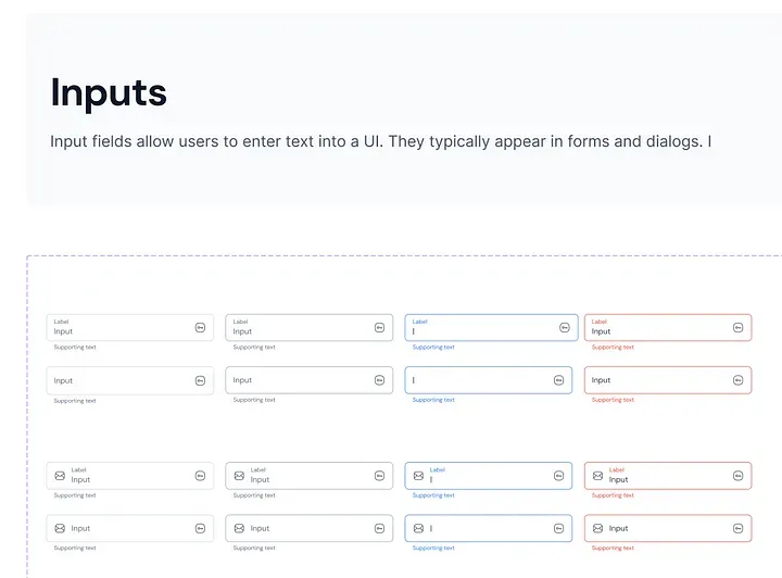
}برای فیلد متن، ما دوباره یک کلاس مستقل AppTextField ایجاد کردهایم.
/// {@template app_text_field}
/// یک ویجت فیلد متن قابل تنظیم با گزینههای سفارشیسازی مختلف.
/// A customizable text field widget with various customization options.
/// {@endtemplate}
class AppTextField extends StatelessWidget {
/// {@macro app_text_field}
const AppTextField({
super.key,
this.controller,
this.labelText,
this.enabled = true,
this.obscureText = false,
this.onChanged,
this.autovalidateMode = AutovalidateMode.onUserInteraction,
this.validator,
this.helperText,
this.errorText,
this.suffixIcon,
this.suffixIconConstraints =
const BoxConstraints(minHeight: 24, minWidth: 40),
this.prefixIcon,
this.prefixIconConstraints =
const BoxConstraints(minHeight: 24, minWidth: 40),
this.autofillHints,
this.onEditingComplete,
this.inputFormatters,
this.keyboardType,
this.maxLines = 1,
});
/// کنترلر برای فیلد متن.
/// The controller for the text field.
final TextEditingController? controller;
/// متن برچسب برای فیلد متن.
/// The label text for the text field.
final String? labelText;
/// اینکه آیا فیلد متن فعال است یا خیر.
/// Whether the text field is enabled.
final bool enabled;
/// اینکه آیا فیلد متن مبهم است یا خیر (برای رمز عبور).
/// Whether the text field is obscured.
final bool obscureText;
/// هنگامی که مقدار فیلد متن تغییر میکند، فراخوانی میشود.
/// Called when the text field value changes.
final ValueChanged<String>? onChanged;
/// حالت اعتبارسنجی خودکار برای فیلد متن.
/// The autovalidate mode for the text field.
final AutovalidateMode autovalidateMode;
/// اعتبارسنج برای فیلد متن.
/// The validator for the text field.
final FormFieldValidator<String>? validator;
/// متن راهنما برای فیلد متن.
/// The helper text for the text field.
final String? helperText;
/// متن خطا برای فیلد متن.
/// The error text for the text field.
final String? errorText;
/// آیکون انتهایی برای فیلد متن.
/// The suffix icon for the text field.
final Widget? suffixIcon;
/// محدودیتها برای آیکون انتهایی.
/// The constraints for the suffix icon.
final BoxConstraints? suffixIconConstraints;
/// آیکون ابتدایی برای فیلد متن.
/// The prefix icon for the text field.
final Widget? prefixIcon;
/// محدودیتها برای آیکون ابتدایی.
/// The constraints for the prefix icon.
final BoxConstraints? prefixIconConstraints;
/// راهنماییهای تکمیل خودکار برای فیلد متن برنامه.
/// The autofillhints for app text field.
final Iterable<String>? autofillHints;
/// هنگامی که مقدار فیلد متن کامل میشود، فراخوانی میشود.
/// Called when the text field value completed.
final VoidCallback? onEditingComplete;
/// قالببندیهای ورودی برای فیلد متن.
/// The input formatters for the text field.
final List<TextInputFormatter>? inputFormatters;
/// نوع کیبورد برای فیلد متن.
/// The keyboard type for the text field.
final TextInputType? keyboardType;
/// حداکثر خطوط موجود در فیلد متن.
/// the maximum lines available in text field.
final int maxLines;
}
@override
Widget build(BuildContext context) {
return TextFormField(
keyboardType: keyboardType,
inputFormatters: inputFormatters,
onEditingComplete: onEditingComplete,
autofillHints: autofillHints,
controller: controller,
enabled: enabled,
obscureText: obscureText,
onChanged: onChanged,
autovalidateMode: autovalidateMode,
validator: validator,
maxLines: maxLines,
style: WidgetStateTextStyle.resolveWith(
(states) {
late final Color textColor;
if (states.contains(WidgetState.error)) {
textColor = context.inputTheme.focusedTextDefault;
} else if (states.contains(WidgetState.focused)) {
textColor = context.inputTheme.focusedTextDefault;
} else if (states.contains(WidgetState.disabled)) {
textColor = context.inputTheme.disabledText;
} else {
textColor = context.inputTheme.defaultText;
}
return context.typography.inputPlaceHolder.copyWith(
color: textColor,
);
},
),
cursorColor: context.inputTheme.focusedTextDefault,
cursorHeight: 16,
decoration: InputDecoration(
labelText: labelText,
labelStyle: WidgetStateTextStyle.resolveWith(
(states) {
late final Color textColor;
if (states.contains(WidgetState.error)) {
textColor = context.inputTheme.errorTextDefault;
} else if (states.contains(WidgetState.focused)) {
textColor = context.inputTheme.focusedOnBrand;
} else if (states.contains(WidgetState.disabled)) {
textColor = context.inputTheme.disabledText;
} else {
textColor = context.inputTheme.defaultText;
}
return context.typography.inputPlaceHolder.copyWith(
color: textColor,
);
},
),
floatingLabelStyle: WidgetStateTextStyle.resolveWith(
(states) {
late final Color textColor;
if (states.contains(WidgetState.error)) {
textColor = context.inputTheme.errorTextDefault;
} else if (states.contains(WidgetState.focused)) {
textColor = context.inputTheme.focusedOnBrand;
} else {
textColor = context.inputTheme.defaultText;
}
return context.typography.inputLabel.copyWith(
color: textColor,
);
},
),
filled: true,
fillColor: enabled
? context.inputTheme.defaultColor
: context.inputTheme.disabledColor,
border: MaterialStateOutlineInputBorder.resolveWith(
(states) {
late final Color borderColor;
if (states.contains(WidgetState.error)) {
borderColor = context.inputTheme.borderError;
} else if (states.contains(WidgetState.focused)) {
borderColor = context.inputTheme.borderFocused;
} else if (states.contains(WidgetState.disabled)) {
borderColor = context.inputTheme.borderDisabled;
} else if (states.contains(WidgetState.hovered)) {
borderColor = context.inputTheme.borderHover;
} else {
borderColor = context.inputTheme.borderDefault;
}
return OutlineInputBorder(
borderRadius: const BorderRadius.all(AppRadius.md),
borderSide: BorderSide(
color: borderColor,
),
);
},
),
hoverColor: Colors.transparent,
focusColor: Colors.transparent,
helperText: helperText,
helperStyle: WidgetStateTextStyle.resolveWith(
(states) {
late final Color textColor;
if (states.contains(WidgetState.error)) {
textColor = context.inputTheme.errorTextDefault;
} else if (states.contains(WidgetState.focused)) {
textColor = context.inputTheme.focusedOnBrand;
} else if (states.contains(WidgetState.disabled)) {
textColor = context.inputTheme.disabledText;
} else {
textColor = context.inputTheme.defaultText;
}
return context.typography.inputHint.copyWith(
color: textColor,
);
},
),
errorText: errorText,
errorStyle: context.typography.inputHint.copyWith(
color: context.inputTheme.errorTextDefault,
),
suffixIcon: suffixIcon,
prefixIcon: prefixIcon,
suffixIconConstraints: suffixIconConstraints,
prefixIconConstraints: prefixIconConstraints,
),
);
}
}اکستنشن برای دریافت تمها با context برای دریافت تمها با context، ما یک کلاس اکستنشن ساده ایجاد کردهایم:
/// یک extension بر روی [BuildContext] که دسترسی به تم فعلی را فراهم میکند.
/// An extension on [BuildContext] that provides access to the current theme.
extension ThemeExt on BuildContext {
/// تم فعلی.
/// The current theme.
ThemeData get theme => Theme.of(this);
/// تم دکمه فعلی.
/// the current button theme
AppButtonTheme get buttonTheme =>
theme.extension<AppTheme>()!.appButtonTheme as AppButtonTheme;
/// تم checkbox فعلی برنامه.
/// The current app checkboxTheme.
AppCheckboxTheme get checkboxTheme =>
theme.extension<AppTheme>()!.appCheckboxTheme as AppCheckboxTheme;
/// تم icon فعلی برنامه.
/// The current app iconTheme.
AppIconTheme get iconTheme =>
theme.extension<AppTheme>()!.appIconTheme as AppIconTheme;
/// تم input فعلی برنامه.
/// The current app inputTheme.
AppInputTheme get inputTheme =>
theme.extension<AppTheme>()!.appInputTheme as AppInputTheme;
/// تم radio فعلی برنامه.
/// The current app radioTheme.
AppRadioTheme get radioTheme =>
theme.extension<AppTheme>()!.appRadioTheme as AppRadioTheme;
/// تم toggle فعلی برنامه.
/// The current app toggleTheme.
AppToggleTheme get toggleTheme =>
theme.extension<AppTheme>()!.appToggleTheme as AppToggleTheme;
/// تم typography فعلی برنامه.
/// The current app typographyTheme.
AppTypographyTheme get typographyTheme =>
theme.extension<AppTheme>()!.appTypographyTheme as AppTypographyTheme;
/// تم avatar فعلی برنامه.
/// The current app avatarTheme.
AppAvatarTheme get avatarTheme =>
theme.extension<AppTheme>()!.appAvatarTheme as AppAvatarTheme;
/// typography فعلی برنامه.
/// The current app typography.
AppTypography get typography =>
theme.extension<AppTheme>()!.appTypography as AppTypography;
/// تم navigation فعلی برنامه.
/// The current app navigationTheme.
AppNavigationTheme get navigationTheme =>
theme.extension<AppTheme>()!.appNavigationTheme as AppNavigationTheme;
/// تم layout فعلی برنامه.
/// The current app layoutTheme.
AppLayoutTheme get layoutTheme =>
theme.extension<AppTheme>()!.appLayoutTheme as AppLayoutTheme;
/// تم badge فعلی برنامه.
/// The current app badgeTheme.
AppBadgeTheme get badgeTheme =>
theme.extension<AppTheme>()!.appBadgeTheme as AppBadgeTheme;
/// تم breadcrumb فعلی برنامه.
/// The current app breadcrumbTheme.
AppBreadCrumbTheme get appBreadCrumbTheme =>
theme.extension<AppTheme>()!.appBreadCrumbTheme as AppBreadCrumbTheme;
/// تم dropdown فعلی برنامه.
/// The current app appDropdownTheme.
AppDropdownTheme get appDropdownTheme =>
theme.extension<AppTheme>()!.appDropdownTheme as AppDropdownTheme;
}خب... در اینجا منظور از AppTheme چیست؟
/// {@template app_theme}
/// کلاس پیکربندی که همه تمهای برنامه را با هم جمعآوری میکند و آنها را به عنوان یک نمونه واحد ارائه میدهد.
/// Configuration class which collects all Themes of app together and provides
/// them as a single instance
/// {@endtemplate}
class AppTheme extends ThemeExtension<AppTheme> {
/// {@macro app_theme}
const AppTheme({
required this.appButtonTheme,
required this.appInputTheme,
});
/// {@macro app_theme}
factory AppTheme.light() {
return AppTheme(
appButtonTheme: AppButtonTheme.light(),
appInputTheme: AppInputTheme.light(),
);
}
/// نمونه [AppButtonTheme] پیکربندی دکمهها را فراهم میکند.
/// [AppButtonTheme] instance provides configuration of buttons
final ThemeExtension<AppButtonTheme> appButtonTheme;
/// نمونه [AppInputTheme] پیکربندی [AppTextField] را فراهم میکند.
/// [AppInputTheme] instance provides configuration of [AppTextField]
final ThemeExtension<AppInputTheme> appInputTheme;
@override
ThemeExtension<AppTheme> copyWith({
ThemeExtension<AppButtonTheme>? appButtonTheme,
ThemeExtension<AppInputTheme>? appInputTheme,
}) {
return AppTheme(
appButtonTheme: appButtonTheme ?? this.appButtonTheme,
appInputTheme: appInputTheme ?? this.appInputTheme,
);
}
@override
ThemeExtension<AppTheme> lerp(
covariant ThemeExtension<AppTheme>? other,
double t,
) {
if (other is! AppTheme) {
return this;
}
return AppTheme(
appButtonTheme: appButtonTheme.lerp(other.appButtonTheme, t) as AppButtonTheme,
appInputTheme: appInputTheme.lerp(other.appInputTheme, t) as AppInputTheme,
);
}
}چگونه تم خود را برای یک پروژه جدید فراهم خواهیم کرد؟

/// {@template theme_scope}
/// InheritedWidget که [AppTheme] را برای برنامه فراهم میکند.
/// InheritedWidget provides [AppTheme] for app
/// {@endtemplate}
class ThemeScope extends InheritedWidget {
/// {@macro theme_scope}
const ThemeScope({
super.key,
required Widget child,
required this.themeMode,
required this.appTheme,
}) : super(child: child);
/// حالت تم فعلی.
/// The current theme mode.
final ThemeMode themeMode;
/// تم فعلی برنامه.
/// The current app theme.
final AppTheme appTheme;
/// تم فعلی.
/// The current theme.
static ThemeScope of(BuildContext context) {
final result = context.dependOnInheritedWidgetOfExactType<ThemeScope>();
assert(result != null, 'No ThemeScope found in context');
return result!;
}
@override
bool updateShouldNotify(ThemeScope oldWidget) => true;
}مدیریت ThemeMode
برای مدیریت فرآیند تغییر حالت بین حالتهای تاریک، روشن و سیستم، میتوانید یک کنترلر و مقداردهی اولیه ساده به صورت زیر بنویسید:
const _kThemeMode = 'themeMode';
/// {@template theme_scope_widget}
/// کلاسی که تمام فرآیندهای تم را مدیریت میکند.
///
/// متد initialize() باید به عنوان شروع کننده برنامه به منظور استفاده از
/// [AppTheme] در برنامه استفاده شود.
/// A class which handles all theme processes
///
/// initialize() method should be used as app starter in order to use
/// [AppTheme] in the app
/// {@endtemplate}
class ThemeScopeWidget extends StatefulWidget {
/// {@macro theme_scope_widget}
const ThemeScopeWidget({
super.key,
required this.child,
required this.preferences,
});
/// ویجت فرزند.
/// The child widget
final Widget child;
/// تنظیمات اشتراکی.
/// The shared preferences
final SharedPreferences preferences;
/// [ThemeScopeWidget] را با ویجت [child] داده شده مقداردهی اولیه میکند.
/// Initialize the [ThemeScopeWidget] with the given [child] widget
static Future<ThemeScopeWidget> initialize(Widget child) async {
final preferences = await SharedPreferences.getInstance();
return ThemeScopeWidget(
preferences: preferences,
child: child,
);
}
/// به منظور استفاده از متدهای [ThemeScopeWidget]، این تابع
/// باید ابتدا فراخوانی شود. فرآیند تغییر تم توسط
/// [ThemeScopeWidget] به صورت خودکار مدیریت خواهد شد.
/// In order to use methods of [ThemeScopeWidget] this function
/// should be called first. Theme change process will handled by
/// [ThemeScopeWidget] automatically.
static ThemeScopeWidgetState? of(BuildContext context) {
return context.findRootAncestorStateOfType<ThemeScopeWidgetState>();
}
@override
State<ThemeScopeWidget> createState() => ThemeScopeWidgetState();
}
/// وضعیت برای [ThemeScopeWidget].
/// The state for [ThemeScopeWidget].
class ThemeScopeWidgetState extends State<ThemeScopeWidget> {
ThemeMode? _themeMode;
/// حالت تم را تغییر میدهد.
/// Change the theme mode
Future<void> changeTo(ThemeMode themeMode) async {
if (_themeMode == themeMode) return;
try {
final index = ThemeMode.values.indexOf(themeMode);
await widget.preferences.setInt(_kThemeMode, index);
setState(() {
_themeMode = themeMode;
});
} on Exception catch (_) {}
}
@override
void didChangeDependencies() {
super.didChangeDependencies();
try {
final themeModeIndex = widget.preferences.getInt(_kThemeMode) ?? 0;
final themeMode = ThemeMode.values[themeModeIndex];
_themeMode = themeMode;
} on Exception catch (_) {
_themeMode = ThemeMode.system;
}
}
@override
Widget build(BuildContext context) {
final brightness = MediaQuery.platformBrightnessOf(context);
final appTheme = switch (_themeMode!) {
ThemeMode.light => AppTheme.light(),
ThemeMode.dark => AppTheme.light(), // در اینجا باید تم تاریک قرار بگیرد
ThemeMode.system =>
brightness == Brightness.dark ? AppTheme.light() : AppTheme.light(), // در اینجا نیز باید تم تاریک در صورت نیاز قرار بگیرد
};
return ThemeScope(
themeMode: _themeMode!,
appTheme: appTheme,
child: widget.child,
);
}
}برای تغییر ThemeMode خود در هر جایی، میتوانید تابع ThemeScopeWidget.of(context).changeTo را فراخوانی کنید!
آخرین مرحله، مقداردهی اولیه پروژه شما با سیستم طراحی ما است.
ما این پیادهسازی سیستم طراحی را به عنوان یک پکیج مستقل نوشتیم و از آن در برنامههای مختلف استفاده کردیم. ابتدا باید wrapper خود را مقداردهی اولیه کنیم:
void main() async {
   WidgetsFlutterBinding.ensureInitialized();
 final app = await ThemeScopeWidget.initialize(const MyApp());
   runApp(app);
 }
ما گزینه دیگری برای ارائه داریم:
void main() async {
   WidgetsFlutterBinding.ensureInitialized();
 final preferences = await SharedPreferences.getInstance();

   runApp(
     ThemeScopeWidget(
       preferences: preferences,
       child: const MyApp(),
     ),
   );
 }
و در MaterialApp، باید به عنوان یک extension ثبت شود:
final theme = ThemeScope.of(context);

return MaterialApp(
  title: 'Flutter App',
  themeMode: theme.themeMode,
  theme: ThemeData(extensions: [theme.appTheme]),
  darkTheme: ThemeData(extensions: [theme.appTheme]),
  home: const MyHomePage(title: 'Flutter Demo Home Page'),
);
چندین متد extension وجود دارد که به توسعهدهندگان اجازه میدهد به هر تم و تایپوگرافی و فقط چند خط کد دسترسی داشته باشند.
context.buttonTheme.linkHover;
context.checkboxTheme.disabled;
context.typography.titleSmall;
برای تغییر تم برنامه، فقط باید تابع زیر فراخوانی شود:
final themeScope = ThemeScopeWidget.of(context);
themeScope.changeTo(ThemeMode.light);دربارهی Assets چی؟
به طور کلی، assets بخشی از سیستم طراحی هستند. بنابراین، ما یک پکیج مستقل ایجاد کردیم که PNGها، SVGها و غیره را برای هر پروژه به عنوان یک پکیج ذخیره و منتشر میکند.

بنابراین، همانطور که میبینید، پکیج assets فونتها، تصاویر رستر و برداری را ذخیره میکند.
- منظور از رستر(raster)، PNGها، JPEGها و غیره است.
- منظور از بردار(vector)، SVGها است.
چرا آنها را در پکیجهای مختلف تقسیم کردیم؟ برای بهینهسازی SVGها، از روش جدیدی استفاده کردهایم، به طوری که تمام SVGها در پکیج vectors در زمان بیلد به نسخه بهینه کامپایل میشوند.

و ما به SSOT (منبع واحد حقیقت) برای دریافت assets خود نیاز داریم:
/// {@template app_icons}
/// کلاس [AppAssets] شامل تمام آیکونهای مورد استفاده در برنامه است.
/// The [AppAssets] class contains all the icons used in the app.
/// {@endtemplate}
abstract class AppAssets {
/// آیکون شخص.
/// person icon
static const person = AssetBytesLoader(
'vectors/person.svg',
packageName: 'assets',
);
/// آیکون فلش چپ.
/// left arrow icon
static const leftArrow = AssetBytesLoader(
'vectors/left_icon.svg',
packageName: 'assets',
);
/// تصویر غمگین نشسته.
/// sitting sad image
static const sittingSad = 'rasters/sitting_sad.png';
/// تصویر ذره بین.
/// magnifying glass image
static const magnifyingGlass = 'rasters/magnifying_glass.png';
}شما میتوانید کلاس گرافیکهای رستر و برداری را نیز جدا کنید.
به خاطر داشته باشید که وقتی از گرافیک رستر در هر پروژهای به عنوان پکیج استفاده میکنید (شما پکیج asset را در pubspec تعریف کرده و از آن استفاده میکنید)، باید فیلد package را تعریف کنید:
Image.asset(AppAssets.sittingSad, package: 'assets')و اگر میخواهید فونت را از پکیج دیگری export کنید، باید فونتهای خود را درون پوشه lib تعریف کنید. برای اطلاعات بیشتر، میتوانید مقاله "Export fonts from a package" را از مستندات فلاتر بررسی کنید
آزمایش سیستم طراحی خود به عنوان یک برنامه مستقل
برای این منظور، ما از Widgetbook استفاده میکنیم. این موضوع بسیار گستردهای برای نوشتن است. برای جلوگیری از طولانیتر شدن مقاله، من در مورد این موضوع به تفصیل ننوشتم. این ابزار مستندات بسیار خوبی دارد که میتوانید آن را بررسی کنید.
به پایان رسید. اگر از مقاله من خوشتان آمد، فراموش نکنید که تشویق کنید!

Comments ()